
Copic Tutorial - Basic Copic Marker Blending Techniques
By Colleen Schaan
The Numbering System
Briefly, the Copic numbering system is an easy-to decipher code that can be used to pick colors that work
well together. Here's what each part represents: Letter = Color Family B-Blue, RV-Red-Violet, Y-Yellow, BG-Blue-Green First Number = Saturation Lower numbers
are more pure and vibrant; higher numbers are less pure and less saturated. Second Number = Shade Lower numbers are lighter shades; higher numbers are darker
shades.
Natural Blending Group
A natural blending group consists of Copic markers that have the same letter, same first number, and a few
digits difference in the last number (Photo 1).

Basic Blending
The key to using Copic markers is knowing that any lighter shade will move the pigment of a darker shade around.
Therefore, when blending two Copic colors together, always use the lighter of the two shades to blend (Photo 2).

Blending Multiple Shades
Most people don't use only two
shades when coloring, so let's put the concept to use by blending three or more shades together-often referred to as on-paper blending. There are a variety of
methods for blending multiple Copic colors together. I like to be quick and efficient, so I apply all of my inks first and then go back and blend.
Step
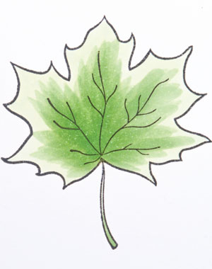
1: Pick three Copic colors that form a natural blending group (G20, G24, G28).
Step 2: Base the area to be colored with the lightest shade
(G20). This helps saturate the paper, which allows for easier blending and creates a vivid undertone (Photo 3).

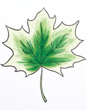
Step 3: Add the medium shade (G24) to areas of the image to be darkened. Leave some of the lightest shade visible, as those areas will become your highlights. In the photo example, I flicked from the center of the leaf out toward the edges (Photo 4).
Step 4: Add the darkest shade (G28) to the areas of the image to be shadowed. Leave some of the medium and light shades visible. In the same manner as before, I flicked from the center of the leaf out toward the edges (Photo 5).
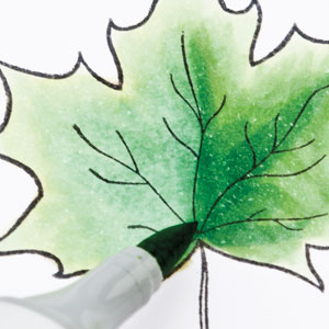
Step 5: Begin the blending process. Using the medium shade Copic marker (G24), make small flicks or sweeping motions where the dark and
medium shades meet. Do not go over the entire dark shaded area or too far into the medium shaded area (Photo 6).

Step 6: Using the same technique, blend the medium shade into the light shade with the light Copic marker (G20) (Photo 7).

Step 7: Repeat steps 5 and 6 as necessary to get a smooth transition from light to dark.
Tips, Tricks & Troubleshooting
Apply the first shade of ink using small circles to saturate the paper.
Apply additional shades by flicking the color on. This leaves a darker area at the beginning of the stroke and a lighter area at the end of the stroke making it easier to blend.
Don't rush the process. When blending, go over the area once with the lighter shade and wait. As it dries, it will continue to blend. If necessary, go back and blend some more. Continuing to go over the area all at once will over-saturate and over-blend.
Do not go into the darkest areas with the lightest marker. This will lighten up all of the dark and you will lose any contrast. This is considered over-blending (Photo 8).
If needed, add additional medium and/or dark ink back into the image and re-blend.
This Copic tutorial was first published in the September 2012 issue of CardMaker magazine. To get more information on Copic marker techniques:
- Purchase a copy of Colleen's book Copic Coloring Guide.
- Check out Colleen's blog, www.distinctivetouches.com.
- Subscribe to CardMaker magazine, where Colleen has a regular column featuring Copic marker techniques.
