
Copic Tutorial: Coloring White
By Colleen Schaan
As we head into the winter months and the snow begins to fall, the timing seems right to share a little lesson on how to use Copic markers to color white. You know -- that color that isn't really colorful? At least that's what most people think, but I'm here to show you just how colorful white can be.
If White Isn't White, Then What Color Is It?
Let's start with a little exercise. Take a look around you. Do you see an object that is white? Take a closer look at it. What do you see? Do you notice any other colors -- any highlights or shadows? I hope so!
White actually reflects color back to our eye. If the object has any depth, we see a multitude of shades and sometimes even different colors depending on what the object is and its setting.
So, if white is so colorful, how do you know what colors to use when coloring it?
Let's take a look at some simple Copic coloring basics to help answer that question.
When coloring white, there are some basic rules to follow depending on what the object is and its surroundings.
Coloring Subjects With Tones
If the object is a live subject, it is typically colored in warm tones (Photo 1).

If the object is cool to the touch like snow or ice, it is typically colored in cool tones (Photo 2).

If the object is inanimate, it is typically colored in neutral tones (Photo 3).

Translating Coloring With Tones to Your Work
Once you select the right color to represent your white object, the real trick is in knowing how to use it and where to place it. The traditional light/medium/dark Copic marker blending rule just doesn't work with white. The white is actually the mid-tone or medium shade. When coloring white, you most often focus on coloring the shadows.
It's pretty easy when you think of it this way -- pick the appropriate color tone (warm, neutral or cool) and use it to add color to the shadowed areas of the white object. Limit your blending as the image will often look muddy or dirty if you blend too much or if you blend out to pure white. Don't be afraid to leave crisp shadows. Also don't go overboard; keep the colors fairly light and subtle (Photo 4).

Is It ALL In the Shadows?
While filling the shadows of a white object with color will help portray depth in the image, there is an additional step that you can take to make your work pop even more.
You've added your colorful shadows and you left the white mid-tones, but don't forget about those highlights! At this point you may be wondering: How do you highlight white? Remember that white reflects light, so think about the "color" of the light that is hitting your white object. If it's a bright sunny day, the light might have a warm yellow tint. If it's dawn or twilight, the light might have a dusky blue, mauve or even pink tint. That is the color that would be reflected back to you in a highlight on a white object (Photo 5).

Again, don't go overboard. A tiny hint of color goes a long way in adding highlights.
Possible Shadow Colors
Here are just some of the Copic colors that I like to use for adding shadows to white objects. Remember to keep the color tone (warm/cool/neutral) in mind when picking your colors (Photo 6).
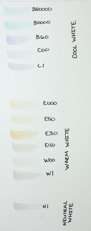
Source: Bundled Up Mike stamp from Whipper Snapper Designs Inc.
TIP: The darker the Copic shade, the less color you will need to use. Using too much of the darker shades will obscure details and diminish contrast.
This Copic tutorial was first published in the November 2011 issue of CardMaker magazine. To get more information on Copic marker techniques:
- Purchase a copy of Colleen's book Copic Coloring Guide.
- Check out Colleen's blog, www.distinctivetouches.com.
- Subscribe to CardMaker magazine, where Colleen has a regular column featuring Copic marker techniques.
